Newport Beach Jazz Festival
The Newport Beach Jazz Festival, established in 1996, has grown into a beloved annual event that celebrates the rich tradition of jazz music. To enhance its appeal and create a distinctive atmosphere, I decided to undertake a fun and themed rebranding initiative. This new approach aims to highlight the festival's vibrant culture, attract a broader audience, and provide a memorable experience for both music enthusiasts and newcomers alike.
Logo Design
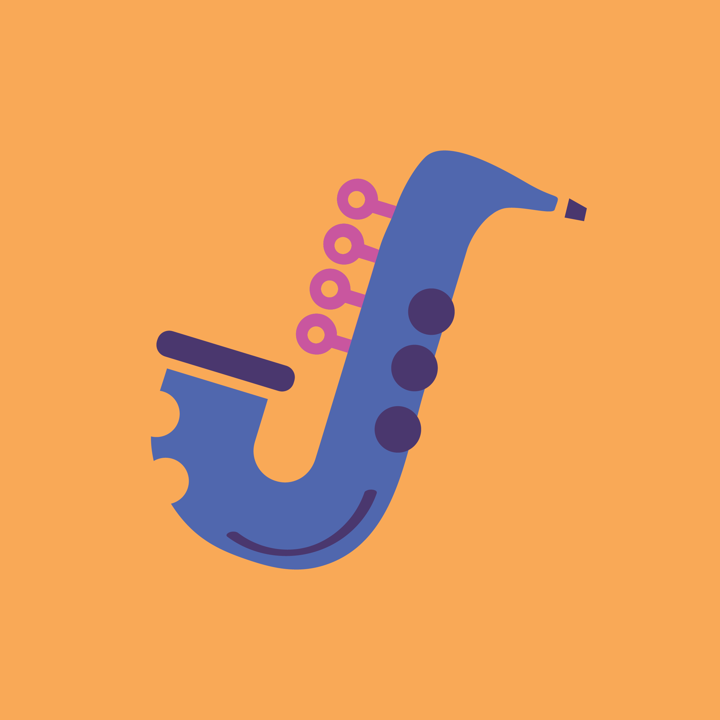
The logo was designed to rebrand and refresh the identity of the brand. The word "Jazz" is displayed in Caraque Bold Solid, making it bold and eye-catching. The secondary font, Marvin Round, adds a sense of fun and movement. The letter "J" has been creatively transformed into a saxophone, emphasizing the iconic instrument that is central to jazz music. The color palette evokes a nostalgic yet modern feel, reminiscent of blues music and a beachside sunset.


Poster Design
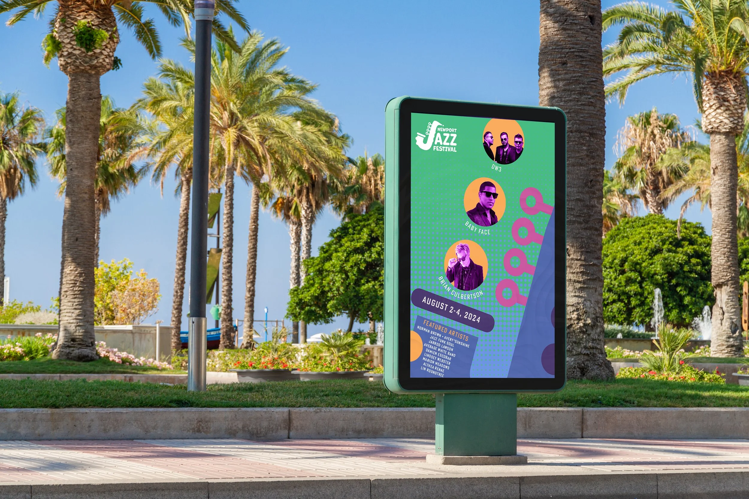
The poster prominently features the silhouette of the J saxophone logo, which embodies the brand's identity. It incorporates a unique texture and pattern that align with some mockups, creating visual cohesion. The brand's colors are prominently displayed, enhancing the poster's impact and making it eye-catching. This combination makes the poster not just a marketing tool, but also a striking piece of art that reflects the brand's creativity and quality.


