Schwarburger
Growing up in the Philadelphia area and being a big Phillies fan, I knew that I wanted to create something that combines my love of sports with my passion for graphic design. Over the summer, I thought of the idea for a restaurant inspired by the Phillies slugger, Kyle Schwarber, often referred to as “hitting Schwarbombs.” I took that idea and came up with the name Schwarburger. I instantly began brainstorming ideas on how to bring this concept to reality.
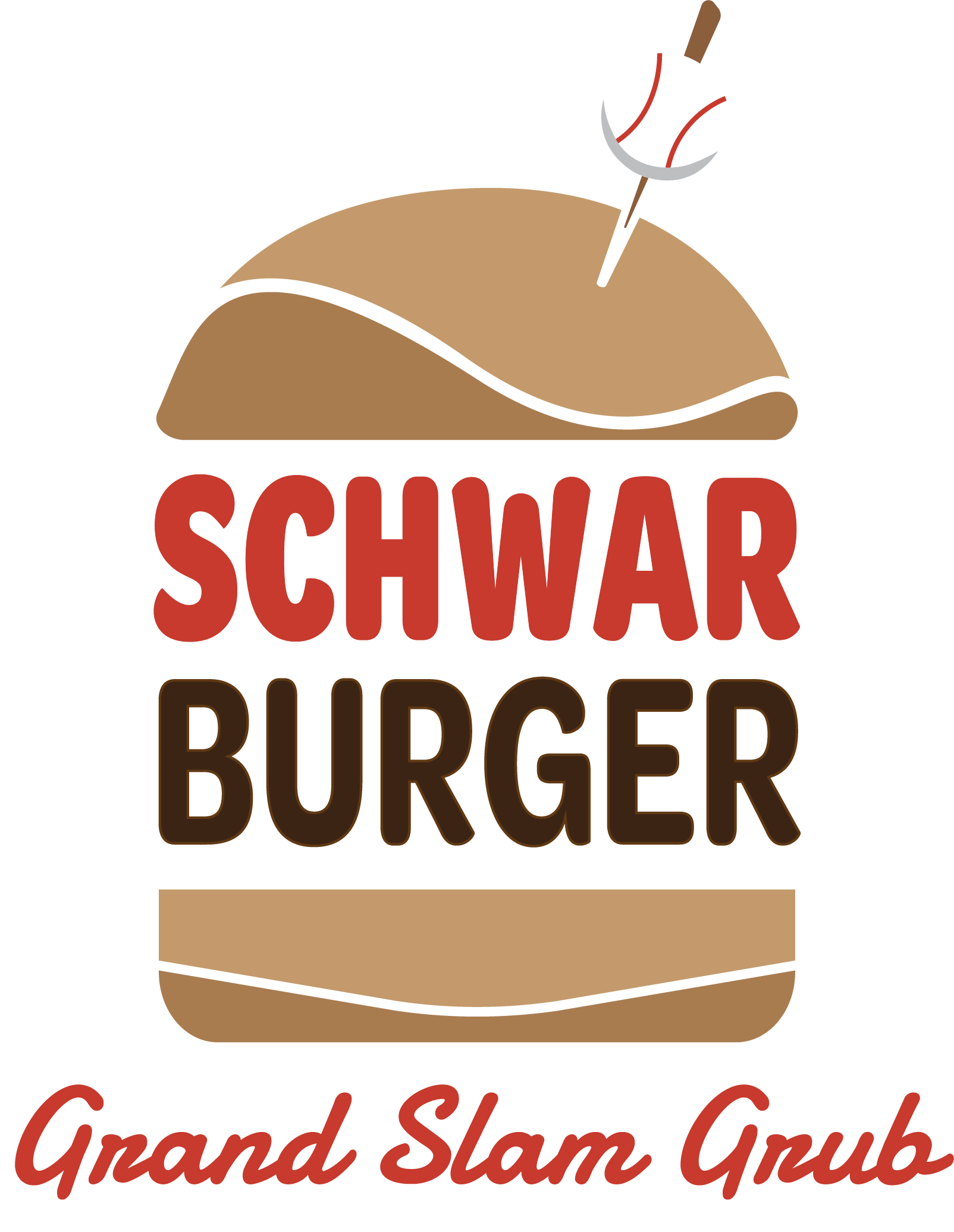

Primary Logo
I played around with the idea of incorporating baseball park elements, jersey fonts, and a retro style into the logo. However, this concept just wasn’t working, so I decided to go a little more unconventional and break the word into two and place it between two burger buns. I was immediately drawn to the fonts Damion and Omnes Cyrillic Narrow Bold as they provided the retro-modern feel I was looking for. The design still looked flat, so I decided to incorporate more color into the buns. The design started to look too vectorized, and to fix this, I used the remove shape tool to create a negative space wave on the top bun and bottom one. I also decided to add a patented skewer with a baseball on top to give it a real American ballpark feel.
Style Tile
I wanted to utilize the colors of the Philadelphia Phillies and incorporate the brown tones from a burger into one. I drew inspiration from the patterns found on sandwich wrappers, which sometimes feature designs, as well as from food baskets and takeout paper. The primary pattern incorporates the classic red and white seen on a Phillies home jersey, while the darker pattern is used to create a contrast with the lighter nature of the main one.Menu
For the menu, I desired an overall design and text that exudes a traditional, old-school feel. I chose Omnes Cyrillic Narrow for the headers and main items to complement them. To emulate that retro feel, I used a script font. For the shape, I created a circle to represent a baseball and added stitchings to emphasize the theme. On the back of the menu, I colored the stitches and added Kyle Schwarber’s signature to give it a personal touch.
Collateral
For the menu, I desired an overall design and text that exudes a traditional, old-school feel. I chose Omnes Cyrillic Narrow for the headers and main items to complement them. To emulate that retro feel, I used a script font. For the shape, I created a circle to represent a baseball and added stitchings to emphasize the theme. On the back of the menu, I colored the stitches and added Kyle Schwarber’s signature to give it a personal touch.
Website
The website presented a fun challenge with numerous assets to work with. Designing the website before creating my poster proved beneficial later on. I aimed for simplicity, showcasing the various assets I had created. The main navigation bar is positioned at the top, directing users to relevant information when clicked. I thoroughly enjoyed the process of creating this website.

Despite some challenges with obscure shapes and creating my own mockups, this project pushed me to realize my best vision. With the help of my professor and peers, I am proud of how it turned out. The skills and adversities I faced during this project will undoubtedly benefit me in future projects, as I continue to improve my critical thinking and problem-solving abilities in design.